Post category: Aspects of Design
Town gardens
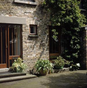
Size: Town gardens tend to be small in size, twenty to about eighty square metres. If larger, they can be treated as small suburban gardens. Generally, they have no view to the outside.
Garden Size
Click here to view bigger sized image
Problems: Small size, high walls, noise, air pollution and lack of privacy.
Small suburban gardens
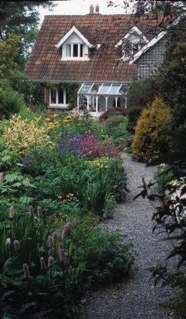
Size: Small suburban back gardens are usually about seventy square metres to about two hundred. Generally, they look onto the backs of other houses and rarely have a view to be retained.
Garden Size
Click here to view bigger sized image
Problems: Small size, bare walls, noise, lack of privacy.
Large Suburban gardens
Size: Large suburban back gardens range from about two hundred square metres to 1,000 square metres. Larger than this, they can be treated as country gardens from a design point of view.
Garden Size
Click here to view bigger sized image
Problems: Usually narrow compared to their length, maybe overlooked, rarely have views worth retaining, poor boundaries – usually fences and hedges, sometimes walls.
Country gardens
Size: Many country gardens are 1,000 square metres or more in extent. Smaller than this, they can be treated as suburban gardens in terms of design size.
Problems: Generally large, costly to fill and difficult to maintain, rarely overlooked, often with good views but may be exposed. Long boundaries to be disguised.
Good garden design aims to use space well. Open areas of lawn, paving or water give a sense of space. To enjoy the garden and its views, adequate space is very important, but space also has its own quality.
Garden Space
Click here to view bigger sized image
Some garden areas have a remarkable ‘feel’ about them, just as rooms in a house are described as ‘pleasant’. The way the garden space is divided largely determines the ‘feel’ of the garden, and how comfortable we are likely to be.
Perception
The proportions and dimensions of the garden, or its divided parts, affect our perception of the space. A long, narrow space feels uncomfortable, likewise a very broad space. It is essential to divide the ground area of the garden to get better proportions.
The height and ‘weight’ of plants and other objects, affect our sense of space. Tall trees can cause a reduction in our perception of the space of a garden without encroaching on the actual space. Likewise, tall deciduous trees are unlikely to cause as great a reduction in perceived space as ‘heavier’ conifers or broadleaved evergreens.
Size
It is interesting to have spaces and objects of different sizes in a design. Without being conscious of it, our eyes constantly record and analyse the size of spaces and objects. Size is measured in three dimensions – length, width and height. Every object and feature in the garden, plant or non-living part, has a measurable size – small, medium or large, and many stages in-between.
Objects like garden slabs, or a seat, are of a fairly precise size. The size of plants, both large and small is impressive; a range of size creates more of an impression – more to analyse. The eventual size of plants varies considerably depending on the soil and site conditions, but they are reasonably predictable.
For example, an oak tree can be expected to become large. It is very useful to have a notion of the size of the units of measurement – one foot, ten feet; one metre, ten metres – both horizontally and vertically.
Proportion
Our impression of the size of any object or plant is relative to other objects nearby. In a newly planted garden, a two-metre high shrub looks large, but the same shrub would be less significant in a garden with large trees. Our eyes measure size, or proportion, at a glance.
Garden Space
Click here to view bigger sized image
It is important to have everything in the garden in balanced proportion. This is true of the garden spaces as well as its features and objects. A very large tree in a small garden looks wrong; equally, isolated small shrubs look wrong in a large garden.
The relationship of the size of objects, and the space they occupy, must be pleasing to the eye. Things must be kept in scale. A little bed of flowers tucked away at the bottom of a large lawn is lost; a little pond in a large lawn is no more than a puddle.
Perspective
Far away objects appear smaller. Although an object like a summerhouse looks large close to, it might appear very small and inconsequential at a distance. The size of such objects needs to be considered in the perspective. Bringing it closer might solve the problem.
Garden Space
Click here to view bigger sized image
The effect can be used to give a garden a false sense of space. Since we expect things in the distance to be smaller, placing small objects and plants at the end of the garden will create an illusion of greater length. The opposite effect can be used to make a garden look shorter.
Weight
Although the dimensions of two objects might be identical, they can be of different weights. For example, a shrub does not have the same weight or mass as a boulder of the same size. We know this just by looking at the boulder. It has a ‘massive’ look to it.
The weighty solidity of hard materials such as paving and walls is one of the reasons that they are so important in the garden as contrast to the lighter living plant material.
Some plants seem to have more weight though they would not physically weigh more. Trees with large dark green leaves look ‘heavier’ than those with more open foliage. For example, lawson cypress is heavy, birch is a light tree. Conifers and broadleaved evergreens tend to be weighty plants; they can be used to good effect in winter among deciduous plants that look distinctly ‘light’ when their leaves are off.
There are many kinds of shape and form, and as many words to describe them. Hard materials can be described as round, square, diamond-shaped, oblong, and rectangular. Plants can be described as pyramidal, pillar, column, fastigiate, flat, prostrate, drooping, weeping, and trailing.
Shape and Form
Click here to view bigger sized image
Outline
Although the three basic dimensions of size, length, width and height, give an indication of the shape of an object, its characteristic outline or form is much more complex. More than anything else, we recognise an object by its outline; shape first, then colour and texture. A black and white photograph has no colour but is still instantly recognisable. Even a silhouette is enough.
Subconsciously, our eyes and brain constantly analyse the shapes that surround us. An interesting garden should be a combination of interesting shapes – a richness to delight the eye.
Garden shape
The shape of the garden is defined by the shape of the ground, the walls, hedges and fences that divide it up, and the plants that decorate it. The basic shape of the garden, formed by the ground shaping and hard materials, must be pleasing in its own right before any plants are added.
For example, a garden site with slopes, terraces, ornamental walls, trellis, water feature, and paved areas would be interesting before any plants are put in.
Plant shape
Although the shape of plants is their most important ornamental feature, it is usually the one least taken into account in choosing them for the garden. The characteristic outline of each plant is unique and ought to be considered carefully. The various shapes should be used in combination to create interesting pictures.
Using plant shape
Plant shapes vary from horizontal (prostrate on the ground) to vertical (narrow upright pillar). The other plant shapes are between the extremes. Rounded shape, for example, has about the same amount of each dimension, tall as wide. The shape of plants can be used in two ways; to accentuate similar shapes, or to contrast with opposites.
Shape and Form
Click here to view bigger sized image
When using plants to accentuate the shape of other garden objects, the idea is to ‘pick up’ the dominant lines of the shape to be emphasised. The horizontal lines of the roof of a house might be mirrored by flat-topped trees or shrubs at a different level.
Trees of columnar shape could be used to emphasise the vertical lines of the house walls. For example, a flat-growing conifer placed at the corner of a house contrasts with the vertical of the wall, while a small tree of columnar shape emphasises it.
Many plants are of rounded, or conical shape and these are very useful for contrast with the rectangular shape of houses, walls, fences, trellis, paths and paved areas. Rounded and conical shapes are of varied height and width.
Considerable added interest can be built into the design by using various rounded, or conical, shapes in association with each other. Since so many plants are of intermediate rounded or conical shape, this effect usually happens when choosing plants for other reasons, but it is no harm to bear it in mind.
Everything in the garden picture provides colour, including the sky in the background. Although we often use the words ‘flowers’ and ‘colour’ interchangeably, it is a mistake to think that flowers are the only source of garden colour.
Sources of Colour
Click here to view bigger sized image
The most important garden colour is the green of leaves. A garden with green trees, shrubs and herbaceous plants, and a nice background of blue sky, can be beautiful without a single flower. The amount of sky seen, and the shape of the skyline as viewed from the garden, can be defined by the choice of trees used. There isn’t much we can do about the sky’s colour!
The colours of the hard materials of the garden contribute to the overall result. These must suit each other and the house, and they will have some influence over the choice of plants. For example, grey, brown or buff-coloured paving will suit any plant colour – green, grey, pink, blue, yellow, white, lime-green, bronze or purple.
Sources of Colour
Click here to view bigger sized image
Dark-green leaves might make grey paving look leaden while grey and silver foliage will ‘lift’ it. Lime-green and bronze look great with yellow, or buff paving. Red paving might not combine happily with certain shades of pink, orange or red. Similarly, the colour of walls can influence the choice of other materials and plants.
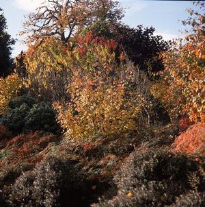
Additional colour sources are fruits and berries, bark and twigs, stems and buds, seed heads. These are very varied and though not major contributors, they are most important in autumn and winter when foliage and flowers are scarce.
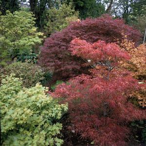
The green pigment chlorophyll, which traps the sun’s energy, is present in every leaf. It sets the underlying colour of plant foliage. The amount of chlorophyll present changes the quality of the green colour. The range of greens – the dark-green of broadleaved evergreens to the yellow-green of beech in May – is enormous.
Foliage Colour
Click here to view bigger sized image
As well as the green pigment, there can be red, purple, yellow and orange pigments in the leaves. The combination of these pigments gives coloured foliage; red, purple, bronze, brown, yellow, golden, lime. The withdrawal of the green pigment by plants before the leaves fall in autumn brings about the autumn colour change when the associated ‘masked’ pigments are more dominant.
Another set of foliage colour types comes from the adaptations of plants to resist heat and cold. Leaves covered with fine hairs take on a grey or silvery appearance. Those which cover themselves with wax take on a blue or grey colour.
Mutant forms of plants that have the green pigment in only part of the leaves provide variegated leaf colour. This might be white variegation if there is no yellow pigment present, or yellow variegation if there is.
It is easy enough to mix leaf colour because the common colour green helps them to blend. ‘Ordinary’ green should be by far the most dominant foliage colour with lesser amount of the other colours; gold, bronze, purple. In particular, variegated foliage should be used sparingly, if at all. Too much variegation is gaudy and unnatural.
It is much better not to use strong contrasts, such as golden variegation with strong blue. Variegated foliage is best with ‘ordinary’ green to tone it down. Blue foliage goes well with silver and grey, and perhaps some ‘purple’.
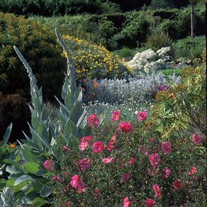
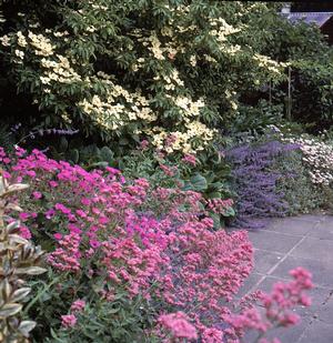
Flowers provide a huge range of colour; different shades, tones and tints of red, orange, yellow, green, blue, indigo and violet – all the colours of the rainbow. Tints are made by adding white to the primary hue; tones by adding grey; and shades by adding black.
Flower Colour
Click here to view bigger sized image
The colour of flowers also varies in intensity, depending on how much pigment is present. This can change during the life of the flower, usually increasing after opening from the bud before fading again.
Flower colour must always be considered with the surrounding foliage and flowers in mind. These can influence how a colour is perceived. White flowers of magnolia will be lost against a pale grey sky in spring, but look dramatic against a dark backdrop.
There is enormous challenge, and satisfaction, in placing flowers to best colour effect with the right foliage and flowers. The result is much greater than the sum of parts. Sometimes, these happy combinations, or associations, occur accidentally, but usually they need to be thought out carefully, worked out by trial and error, or simply copied from photographs or other gardens.
For a colour combination to work, the plants must flower together, and they must be planted so that the lower types can be seen. Flowering times vary slightly each year and sometimes upset well-laid plans. Foliage plants are more predictable than flowers and last longer. Used together with flowers in these associations, they add subtle effects of their own.
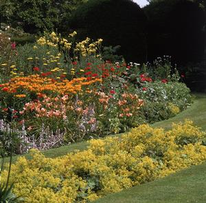
In every garden design, there will be a dominant colour. Green is usually the dominant garden colour, except perhaps in a dry gravel garden with a lot of grey and blue-leaved plants, or a garden with a lot of hard material – walls and paving.
The supporting colours used should complement the dominant colour, and sometimes contrast with it. The amounts of other colours to use is a matter of taste and part of the art of garden design.
Using Colour
Click here to view bigger sized image
For best results, there should always be a reason for using a particular colour and the amount of it that is used. Too much yellow, for example, can spoil a garden. The amount of yellow could be simply reduced, but a little blue or white would cool it down, or orange would fire it up.
Colours should be used in proportion. Powerful, bright and intense colours should be used very little, only to set off the tints, tones and shades. Strong colour is attractive initially but becomes tiring to the eye after a while.
Far off hills look pale blue because the light reaching us in reduced by the dust and water vapour in the air. Plants and flowers of blue or grey colour, and pale flowers, tend to recede into the distance, seeming further away than they are.
By placing blue and grey plants, and pale coloured flowers at a distance, an illusion of greater space can be created. Red, yellow and white are colours that ‘approach’ the viewer. They can be used to shorten distance.
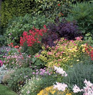
Simple combinations of a few colours are easiest and, because of their simplicity, can be very powerful. Certain colours- white, green, brown, and grey go with everything. These colours vary quite a bit; for example, ‘white’ might be slightly blue (ice-white), yellow (creamy white), pink (warm white), brown (off-white), or green (soft white). Brown is a mixture of all three primary colours: red, blue and yellow. The shade of brown depends on the proportions of the mix.
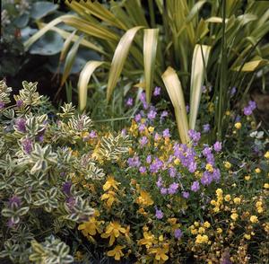
Combining Colours
Click here to view bigger sized image
Colours that are made of two colours are harmonious with their ‘parents’: purple with red and blue: green with yellow and blue: orange with yellow and red. Colours combine well with their opposites, yellow with blue, red with green.
Examples of successful colour combinations include the following: white, pink, grey; white, blue, grey; pink, blue, grey; yellow, white, blue; yellow, pink, grey; yellow, pink, white; yellow, orange, white; red, purple, white; purple, yellow, bluish-pink. Green will always be present as well.
There are countless combinations of the tints and shades of the primary colours. For example, on a yellow theme – palest yellow, canary yellow and lime-green with white, and lilac for contrast.
Successful colour combinations can be worked out by trial and error, moving plants around until they fit. Nice associations in other gardens, or books, can be copied. Another way to work out good colour combinations is to look closely at the parts of the flowers. Surprising combinations can be discovered and then copied using other flowers to contribute each colour.
For example, the flowers of the regal lily are principally white, but closer observation reveals a flush of dark pink-purple on the back of the petals, bright yellow on their insides, golden yellow of the pollen sacs and bright lime-green of the stamens and the deepest part of the flower. An interesting scheme of purple and green foliage plants with white, yellow and lime-green flowers might be made of that.
The question of colour clashes is a little problematic: one person’s colour clash is another’s exciting colour combination!
Colour Clashes
Click here to view bigger sized image
The most common colour clashes involve the colours red and pink. Although pink is a tint of red and combines well with it, pure pink or red rarely occur in the garden. Red and pink generally have a little of either yellow or blue in them. For example, salmon-pink has some yellow in it; cerise-pink has some blue.
It is usually when a yellowish pink, or red, is combined with a bluish pink, or red, that a colour clash occurs. Why this should be is difficult to fathom because blue and yellow themselves combine beautifully!
The other main source of garden colour clashes is placing flowers of intense colour near pastels and pale colours. Dark shades go well with pastels, but not bright, intense colours. A dark shade is not the same thing as an intense colour: a shade is a hue diluted with black, whereas colour intensity depends on the amount of pigment expressed as a colour.
For instance, the intensely red crocosmia ‘Lucifer’ is difficult to associate with other flowers unless they are also of intense colour. White flowers or grey foliage will successfully tone down intense colours, and intense colours can be used to enliven a lot of white or grey.
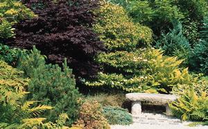
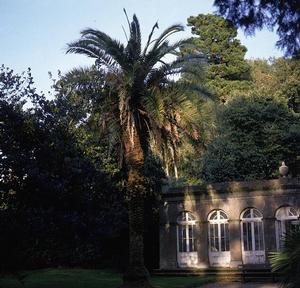
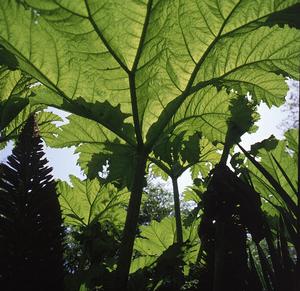
Texture describes the quality of touch; everything in the garden has a distinctive ‘feel’ to it, dramatically illustrated by the Canary Island date palm at Fota, Co. Cork. But there is more to it than that, we subconsciously memorise the appearance of an object and how its surface feels. We relate the ‘feel’ of an object with how it looks. With experience, we are able to form an impression of how an object would feel just by looking at it.
Texture
Click here to view bigger sized image
The pattern of the surface judged by our eyes gives us a clue as to its texture. Therefore, texture has a visual quality to it as well as a quality of touch. For example, if a beach is stony, we can be pretty sure it will feel rough underfoot.
Hard texture
The hard materials of the garden look hard; they have a hard texture. This contrasts with plants, highlights their softness, and is ‘softened’ by the plants. There are other aspects to the texture of hard materials too.
Gravel, stones and cobbles in the garden have a rough, or coarse texture, by comparison with fine, even sand, or smooth concrete slabs. The finish on hard materials has an influence on the plants used with them.
Plant texture
Plant texture is soft by contrast with the hardness of the non-living part, and it is described in very varied ways. For example; sharp (yucca); rounded (hebe); lumpy (laurel); fine (box); strong (tree trunks) ); flimsy (clematis); rugged (scots pine); delicate (ferns); jagged (red hot poker); foamy (gypsophila).
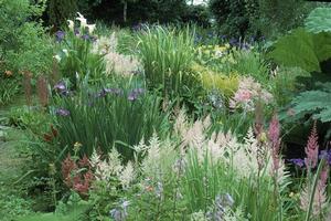
The size of the foliage principally governs plant texture. Large size gives a bold dramatic effect – gunnera(as shown), lysichiton, ornamental rhubarb, acanthus, rodgersia, bergenia, hosta, fatsia, chestnut, hydrangea.
Texture
Click here to view bigger sized image
Small-sized foliage is calm and soothing – broom, tamarisk, box, lithospermum, lonicera, yew, many conifers, santolina, heather, thyme, dicentra.
The shape of the leaves, and how they are arranged on the stems, contribute to a plant’s characteristic texture. For example, japanese maple has quite large leaves but they are much divided in many varieties, and they are usually held in layers above each other. The result is a delicate, feathery fern-like effect.
Plant texture can be deceptive; the pattern of foliage, or bark, can be misleading. For example, gorse looks to have fine, soft texture but is very spiny to the touch. The bark of redwoods looks hard but it is soft and spongy to touch.
Distance can affect the perception of texture. From a distance, the needles of some pines look fine and silky; up close, they are as coarse as a yard brush.
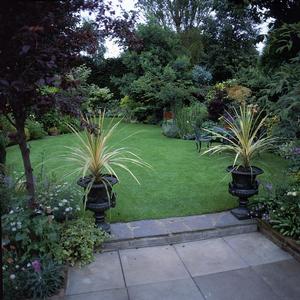
Using texture
Variation of texture lends interest to the garden. Most plants have medium-sized leaves and unremarkable texture. Now and then, some really bold dramatic foliage, or fine, soft foliage, should be used to make a change, such as the astelia in this arrangement of pots.
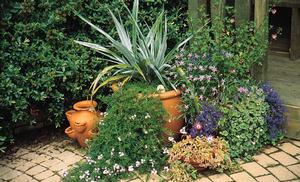
Texture
Click here to view bigger sized image
The soft texture of plants contrasts with the hard texture of walls and paving, but even better effects can be created. Bold plant foliage is good with fine non-living material – large leaves with smooth paving or sand. Equally, the fine textured foliage of blue fescue, tamarisk or dwarf pine, looks good with the rough texture of gravel.
Since most things are small and fine textured in the distance, an impression of space can be created by placing fine textured plants at the end of the garden, bold texture close by.
Black is not a colour; it is the absence of light. Without light, we cannot see colours; they all appear black. When light is low, colours appear darker than they are normally. Lack of light makes it difficult for the eye to discern the depth of a pool of shade.
Light and Shade
Click here to view bigger sized image
Dark coloured objects recede; they appear further away even though they can only be the same distance as objects of bright colour. This trick of light and shade can be used to give the garden a greater sense of depth, useful for a short garden. Alternating pools of light and shade accentuate this effect by creating a pattern.
Light falling into the garden forms patterns of light and shade, most marked when the light is strongest, adding a very attractive extra dimension to the garden. Not only does the pattern of shadows bring movement to the garden but it varies quite a bit in its quality. On a dull day, the pattern will be soft and ill-defined; on a bright one, it will be dark and sharp.
The quality of light varies between the seasons, and from climate to climate. The spring light is clear and slightly blue, autumn has a yellow quality. The light in dry sunny countries is sharp and more harshly white. In damp climates, the light is softened and diffused by the moisture in the air. Even a single day, the quality of light changes and can bring interesting effects to the garden.
Shade
Plants greatly influence the pattern and quality of shade. Some cast deep shade because of their heavy canopies; others are light. All plants cast distinct patterns according to their shape and the arrangement of their foliage.
Planting for shade is rarely considered in cooler climates; any shade pattern that might come about is incidental to other planting considerations. But, it can be very beautiful in its effect and might be given more consideration. Pattern is best seen on a flat surface such as lawn or paving. Plants of any kind, even low ground-cover, tend to dominate the pattern of shade and spoil it.
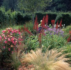
A garden is made more pleasant and challenging to the viewer if a variety of features, plants, colours, shapes, sizes and texture are used. The more variety there is, the longer the eye has to linger to record what it sees. Contrasting shapes, colours, sizes and textures make the eye work hard.
Variety and Unity
Click here to view bigger sized image
While variety is essential to good design, it is easily overdone. Too much variety creates a fussy, restless effect that is uncomfortable. When there is too much contrast without pattern, the eye cannot take it all in and quickly loses interest.
Unity
Unity is the opposite of variety. Other words often used to describe aspects of this important principle of design are simplicity, integrity, repetition, emphasis, harmony.
In choosing plants, unity of design is maintained by using only plants that are necessary. Lacking a clear role, unnecessary plants produce a fussy result. Certain features like hedges, walls, paved areas and lawns have their own inbuilt unity of shape, colour and texture and they help to link together the elements of the garden.
Using the same plants, colours, shapes or textures helps to unify the garden design. For example, one hosta above five metres away from a group of three others makes a link for the eye, or the repeating of a distinctive shape like a columnar-shaped tree, or a series of terraces or steps.
Variety and Unity
Click here to view bigger sized image
Smooth lawn or paving emphasises the flat stillness of water; blue flowers pick up its reflected sky-colour. Subtle repetition creates a rhythm that relaxes the eye and hold the design together.
By contrast, too much repetition of the same few plants have quite the opposite effect. For example, having trees of purple alternate with those of variegated foliage. Unity taken this far is obvious and boring.
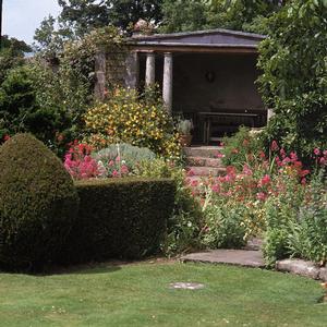
A garden should always retain a sense of mystery. The entire area must not be revealed at once. A garden’s secrets should yield themselves slowly. This is easier to achieve in a large garden, but it can be done in small gardens too.
Mystery and Focus
Click here to view bigger sized image
In a large garden, it might be possible to make a separate secret garden. Tucked away behind hedges or walls, its existence might be completely unsuspected from an initial inspection. Similarly, winding paths in large gardens will maintain the mystery as they are negotiated, particularly if the ground rises and falls. Divisions with hedges and walls create the same effect.
In small gardens, winding paths and secret gardens might not be possible for reasons of space, but hedges fences or foliage can be used to break up a clear view. For example, a tree of weeping shape might hide a seat, or shady corner with ferns.
In the smallest gardens, one or two large plants among smaller ones will break the view and create curiosity about what lies beyond. The sense of mystery is heightened if there is partial revelation. For example, a glimpse of a flowering plant behind another.
If mystery is created, there ought to be surprise when the secret is revealed. When a turn of a pathway is reached, a new garden vista might be revealed; or a nice view, a stream, a garden seat, a statue, a special plant.
It should not suddenly present the viewer with a boundary fence, a compost heap, or a busy roadway, a dirty watercourse or other disappointment. There must be a pleasant reward for investigating.
On a smaller scale, a plant larger than its neighbours might be hiding a special plant grouping, a little ornament, a handsome piece of rock or piece of dead wood.
Focus
As much as mystery seeks to delay our discovery of the garden’s secrets, focus is used to draw attention to particularly beautiful and important garden features.
The most obvious way to draw attention to a garden feature is to light it up. An ornament, the house itself sometimes, might be lit up by floodlight or spotlights. There are other ways of drawing attention to an object or plant. A straight pathway will immediately draw the eye to its end; single or double lines of trees, hedges, openings in walls and hedges achieve the same result.
Mystery and Focus
Click here to view bigger sized image
Disguise is very often part of the reason for focussing attention on some object. For example, a piece of sculpture, or a good specimen plant might be used in an otherwise dull garden to deflect the viewer’s eye from the rest of the garden.
An interesting ornament, or seat, at the end of a short garden will distract attention from it lack of size. If the garden is short but wide, a path leading to the seat will reinforce the illusion of greater space and length.
Panels of trellis placed on a blank wall focuses attention on the trellis, not the wall. One or two climbing plants on a wall, while not completely hiding it, reduce its blankness by drawing attention to themselves, their shape and colour.
Straight lines, squares, circles, rectangles, and diamonds: the use of strict geometric shapes in the garden creates formality. Very often, the hard, non-living part of the garden has a strong element of formality. For example, paving slabs are square or rectangular. These formal materials can be laid out in a strictly formal design, or they can be laid to less formal patterns.
Formality
Click here to view bigger sized image
Although plants are informal in shape, they can be used formally. Hedges and clipped shrubs are usually formal. If plants are planted in rows, it imposes a certain amount of formality on the garden.
Formal garden designs are often laid out symmetrically. That is, the two sides of the design match each other. The effect of symmetry is very strong, linking the garden and making it easier to take in initially. Then, the eye begins automatically to check out the symmetry; that’s when a few breaks away from perfect symmetry are interesting.
Formality need not be linked with symmetry, however. Some modern designs use geometric shapes without matching them up symmetrically. This kind of design can be very interesting and ‘modern’. It would best suit a house of similar architecture.
Informality
Flowing lines, curves, irregular shapes, the shapes of nature are informal; they lack geometric precision. While the hard materials of the garden are often formal, the plant materials are always informal unless they are trained or clipped.
Plants are best left grow naturally – informally. They look better with their distinctive natural shape. Because there is no clipping and tying, they are easier to maintain. Weeds and untrimmed edges are not as noticeable in an informal garden and the level of maintenance can be less assiduous.
House
The house itself is geometrically formal, and formal garden features like rose beds, bedding plants, paving, paths and formal pools are best associated with it. In general, the garden should become less formal as it goes away from the house. With small gardens, the whole garden might be strictly formal because it is still within the influence of the house itself. Country gardens should become less formal at a distance so that they fit happily into their informal surroundings.
Formality
Click here to view bigger sized image
A combination of formality and informality is the best approach to garden design. The hard materials of the garden tend to be formal anyway and they can be allowed to bring some formality to the garden. Hard materials can have a formal informality – formality of texture, surface and shape and informality of line!
Plants are informal and they can be used to balance the formality of the hard parts. The combination gives a design of subtlety and strength.
Every design should have hard materials as well as plants. Among plants every garden must have trees for skeleton, evergreens for weight, shrubs and flowers for shape and colour. A few key ornaments should be used.