Post category: Using Colour
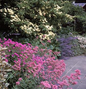
In every garden design, there will be a dominant colour. Green is usually the dominant garden colour, except perhaps in a dry gravel garden with a lot of grey and blue-leaved plants, or a garden with a lot of hard material – walls and paving.
The supporting colours used should complement the dominant colour, and sometimes contrast with it. The amounts of other colours to use is a matter of taste and part of the art of garden design.
Using Colour
Click here to view bigger sized image
For best results, there should always be a reason for using a particular colour and the amount of it that is used. Too much yellow, for example, can spoil a garden. The amount of yellow could be simply reduced, but a little blue or white would cool it down, or orange would fire it up.
Colours should be used in proportion. Powerful, bright and intense colours should be used very little, only to set off the tints, tones and shades. Strong colour is attractive initially but becomes tiring to the eye after a while.
Far off hills look pale blue because the light reaching us in reduced by the dust and water vapour in the air. Plants and flowers of blue or grey colour, and pale flowers, tend to recede into the distance, seeming further away than they are.
By placing blue and grey plants, and pale coloured flowers at a distance, an illusion of greater space can be created. Red, yellow and white are colours that ‘approach’ the viewer. They can be used to shorten distance.