Post category: Colour Clashes
The question of colour clashes is a little problematic: one person’s colour clash is another’s exciting colour combination!
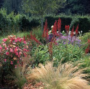
Colour Clashes
Click here to view bigger sized image
The most common colour clashes involve the colours red and pink. Although pink is a tint of red and combines well with it, pure pink or red rarely occur in the garden. Red and pink generally have a little of either yellow or blue in them. For example, salmon-pink has some yellow in it; cerise-pink has some blue.
It is usually when a yellowish pink, or red, is combined with a bluish pink, or red, that a colour clash occurs. Why this should be is difficult to fathom because blue and yellow themselves combine beautifully!
The other main source of garden colour clashes is placing flowers of intense colour near pastels and pale colours. Dark shades go well with pastels, but not bright, intense colours. A dark shade is not the same thing as an intense colour: a shade is a hue diluted with black, whereas colour intensity depends on the amount of pigment expressed as a colour.
For instance, the intensely red crocosmia ‘Lucifer’ is difficult to associate with other flowers unless they are also of intense colour. White flowers or grey foliage will successfully tone down intense colours, and intense colours can be used to enliven a lot of white or grey.